A cohesive outdoor color palette comes from repeating a limited set of colors across plants, hardscape, furniture, and accessories while allowing seasonal accents to change. Start with the fixed colors you cannot easily replace, choose one dominant direction, then repeat a few supporting hues so the space feels connected rather than matched item by item.
TL;DR: Photograph the space, identify permanent colors first, pick a simple dominant-plus-supporting palette, repeat those colors in several zones, and use foliage as the bridge. Treat color rules as design tools rather than facts; personal preference, architecture, light, and season should shape the final mix.
Begin with what is already permanent
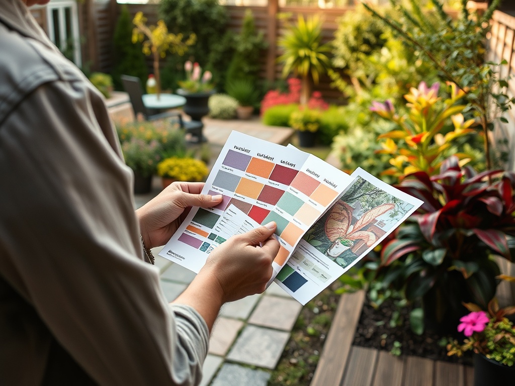
The easiest way to create an outdoor landscape color palette is to stop looking at flowers first. Roof shingles, brick, siding, fences, pavers, decking, stone, metal finishes, mature evergreens, and existing furniture often occupy more visual area and stay in place much longer than annual blooms.
Walk outside at the time of day you use the space most. Take wide photos from the street, patio, and main windows. Then list the fixed colors you see. A house with warm red brick, tan stone, and bronze fixtures already suggests a warmer base. A gray exterior with black metal and pale concrete can support cooler or higher-contrast combinations.
Penn State Extension’s principles of garden design describes unity, repetition, balance, contrast, scale, and rhythm as core design concepts. Those principles are useful because color does not operate alone. Repeating one hue can create rhythm; putting all bright color on one side can make a landscape feel visually unbalanced.
Decide what “cohesive” means for your space
Cohesion is not the same as using one color everywhere. A monochromatic garden can be calm and controlled, but it is only one option. Some people prefer adjacent colors such as blue, violet, and pink. Others like complementary contrast, such as purple against yellow-green foliage.
These are aesthetic strategies, not horticultural requirements. The “best” palette depends on the mood you want, the architecture, surrounding views, and the plants that will actually thrive in the site. Plant health should come before forcing a color scheme into unsuitable sun, soil, or moisture conditions.
A useful planning sentence is: “The fixed background is ___, the dominant garden color is ___, and the accents are ___.” Keeping that sentence short prevents the palette from expanding every time you visit a garden center.
Build the palette in five steps
1. Choose a dominant neutral or green base
Most outdoor spaces already have a large amount of green. Treat foliage as part of the palette rather than as empty background. Deep evergreen, blue-green, chartreuse, silver, and burgundy foliage can carry color for months longer than flowers.
Hardscape neutrals also matter. Gray concrete, cream gravel, reddish brick, weathered wood, and black metal each change how flower colors appear beside them.
2. Pick one main flower-color family
Choose the color you want to notice first. It could be white, blue, pink, red, yellow, orange, or purple. Then select plants with different values and intensities within that family instead of buying one of every color.
For example, a blue-violet palette can include pale lavender, medium violet, deep plum foliage, and white accents. A warm palette might use coral, burnt orange, cream, and burgundy.
3. Add one supporting color
A supporting hue keeps the design from feeling flat. It can sit near the dominant color on the color wheel for a softer effect or oppose it for more contrast. There is no objective rule that one approach is superior.
If attracting pollinators is also a goal, plant choice should consider more than human color preference. Penn State’s guidance on flower color and pollinators notes that flower shape, timing, nectar, pollen, scent, and other traits influence pollinator use as well.
4. Repeat colors across the whole view
Repetition is what turns a collection into a composition. If blue appears only in one container, it can look accidental. If the same blue appears in a distant planting, a cushion, and a ceramic pot, the eye reads a relationship.
This does not require identical products. Repeat a color family, not necessarily the exact dye lot. Outdoor materials weather, and plant colors shift with temperature, maturity, and light.
5. Reserve a small accent category
Seasonal accents keep the landscape flexible. Annuals, pillows, table linens, planters, or portable decor can carry a temporary color without forcing a permanent redesign. If outdoor textiles are part of the scheme, keeping them maintained helps the palette look intentional; the guide on keeping outdoor cushions cleaner for longer covers practical care.
Let foliage carry the shoulder seasons
A flower-only palette can collapse when bloom periods end. A more durable plan uses foliage, bark, stems, seed heads, evergreen structure, and hardscape as color anchors.
Think of the year as a sequence:
- Spring: bulbs, fresh foliage, flowering shrubs.
- Summer: perennials, annuals, ornamental grasses, patio textiles.
- Autumn: foliage change, seed heads, grasses, late flowers.
- Winter: evergreen foliage, bark, branches, stone, fencing, containers, and structures.
A cohesive landscape can change dramatically between seasons while still repeating familiar background colors.
Avoid the most common palette mistakes
Buying plants by flower color alone
A plant that matches perfectly but fails in the site will not support the design for long. Check mature size, hardiness, sun exposure, soil, drainage, and maintenance needs first.
Using equal amounts of every color
When every color competes at the same intensity, the eye may have no clear place to rest. Give one color family more visual weight and let accents stay secondary.
Ignoring the lawn as a major color field
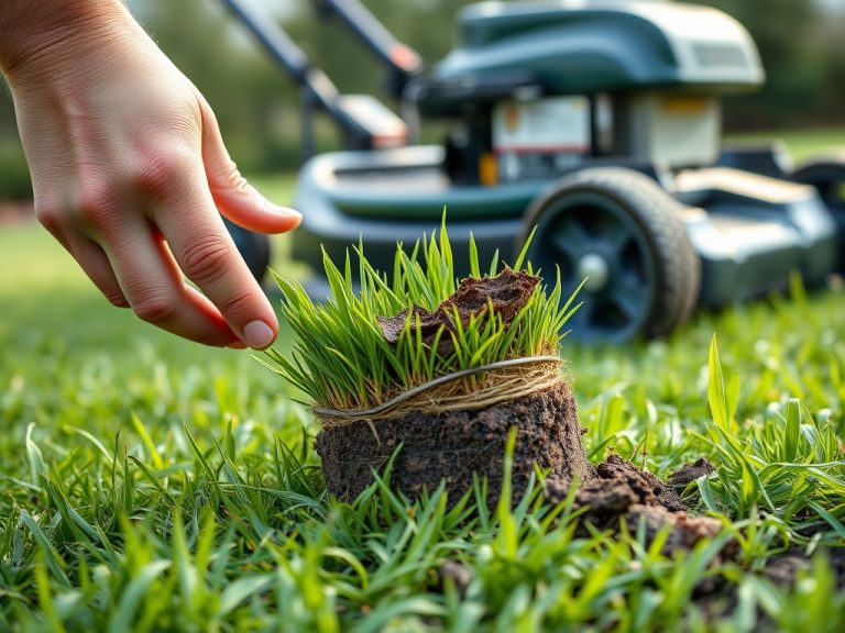
A broad lawn can be one of the largest green surfaces in the view. Keeping it healthy without unnecessary intervention supports the overall backdrop. If that lawn develops a genuine thatch problem, the truth about lawn dethatching explains when removal is useful and when it is not.
Changing every zone independently
Front entry, side yard, patio, and back border do not need identical plants, but a repeated color, material, or foliage type can connect them.
Forgetting maintenance reality
A palette that relies on constant deadheading, replacement annuals, or pristine pale textiles may be frustrating if your available maintenance time is limited. Design should match how the household actually uses the space.
Let repetition do the visual work
A cohesive outdoor palette is less about finding perfectly matching shades and more about intentional repetition. Use permanent materials as the starting point, select plants that suit the growing conditions, repeat a limited color family across the landscape, and let seasonal accents add personality.
The result should feel connected from one view to the next while still reflecting personal taste. If structures become part of the scene, a greenhouse versus cold frame comparison can help you choose a season-extension element before trying to integrate its materials and color into the wider design.
Home and garden content is for general educational purposes and does not constitute professional landscape, structural, electrical, or horticultural advice. Color preference is subjective, and plant suitability varies by climate, site conditions, and local requirements.[/